|
Abstract Photography uses techniques that you don't find often in other media such as the use of being out of focus to isolate parts of the photo. Abstract photography is similar to abstract art as it they both focus on shape, form, colour, pattern and texture. Usually the viewer can't see all of the main object or person to leave the viewer questioning. The angle in which the photo is taken is a very important effect if you wan't to capture shadows and reflections.
|
|
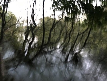
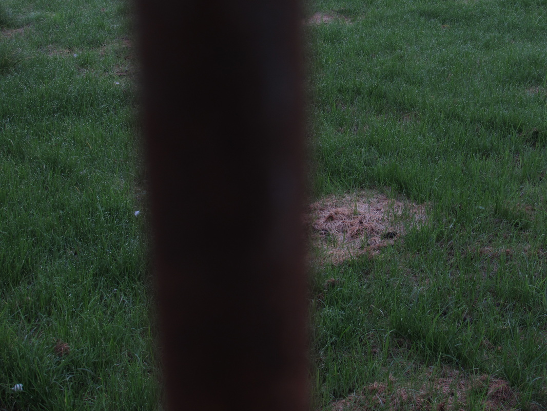
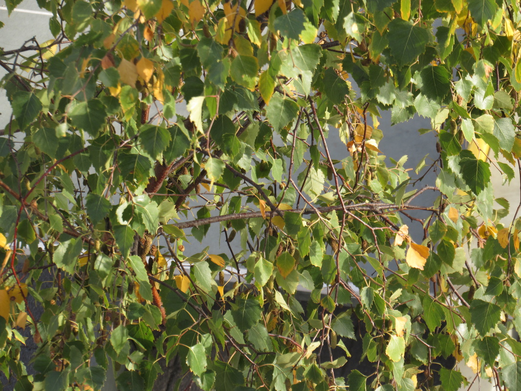
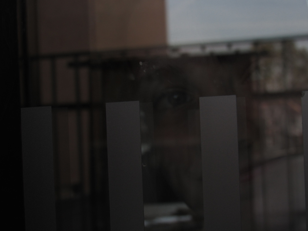
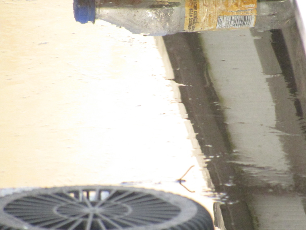
I took this picture on my iphone for further experimentation in a lake near my house for my first shot at abstract photography. The picture is out of focus and moved my phone around a bit until it gave the abstract look. My previously taken photo was pretty much the same photo taken at the same angle but I didn't get any sort of abstract rules implemented into my photograph. I done this by shaking my phone to make it have a out of focus effect.
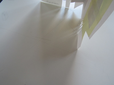
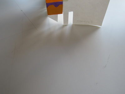
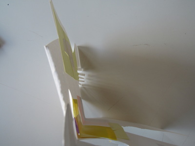
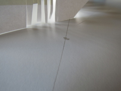
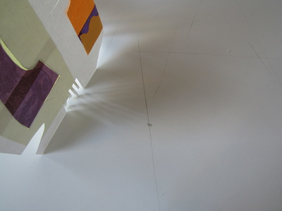
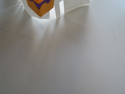
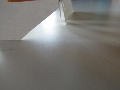
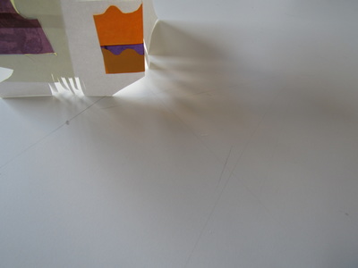
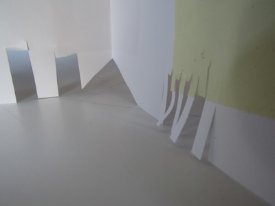
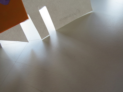
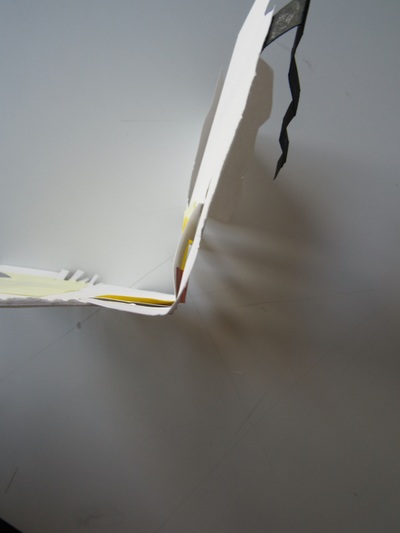
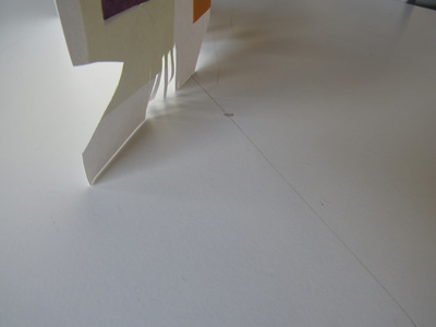
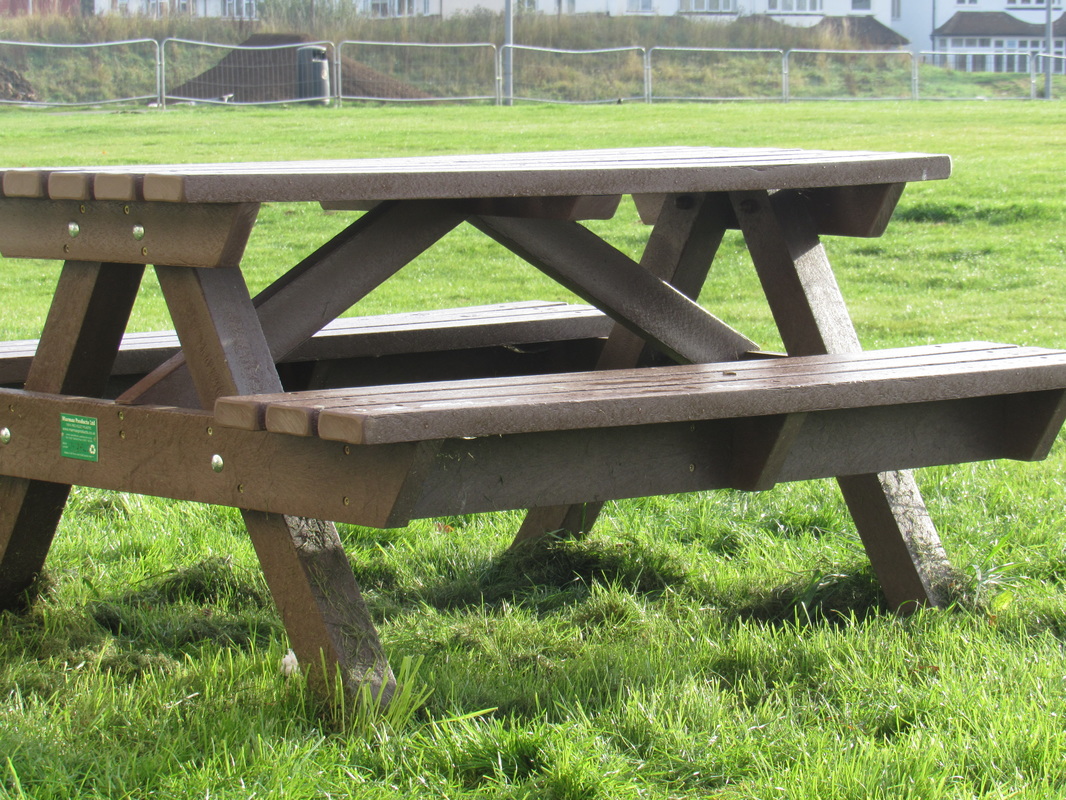
Our task was to take photographs of our sculptures to get the shadows that they give off on the table. In the sculptures we used card, film paper, coloured paper, post-it notes and many other materials. You couldn't have anything in the background other than the white tables. We photographed them at different angles to get the unique shapes the shadows give off the sculpture. We watched Anna Lucas video for inspiration for our sculptures and angles and reflections. Most of my photo's look very similar so I need to experiment more with different angles and need to move around the sculpture for different bits of lighting.
My Abstraction Pinterest page
Analysing Abstract Photo's
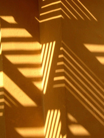
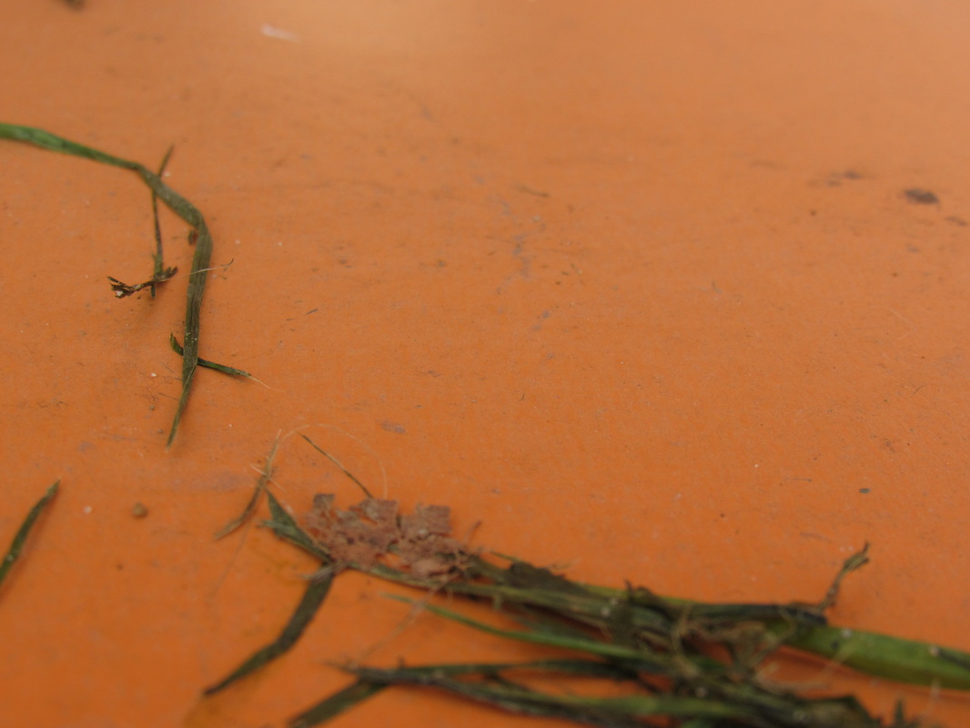
I think this photo is abstract because the photographer use techniques that are rarely seen in other categories of photography. This photo focuses on lighting to give off the shadow on this bright orange wall. The picture uses soft natural light that the sun gives off and line and direction of what the lines of shadows are in. Texture is a formal element where you can see the grain in the wall and would feel very rough to the touch if you could feel it yourself. The indentation in the wall that is captured as the main subject really gives the photo depth. The sun is probably on the left side of the image because the light is a lot lighter and the shadow are generally longer and thicker.
Ernst Haas: Expressive colour
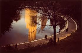
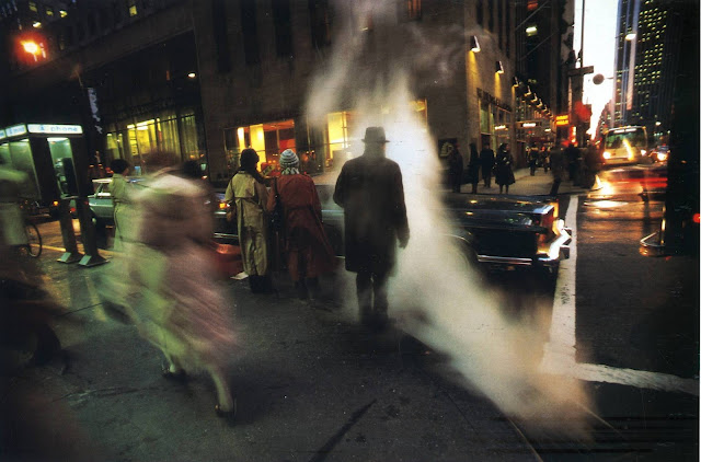
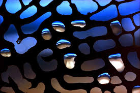
Expressive Colour: Ernst Haas focuses on colour and Reflections in his photographs and the bright colours are what made them stand out the most for me. His Attention to framing makes the photo a lot better. He uses aspects of street photography as well as abstract in his work. The artists brings attention to the centre of the image where there is the reflection on the pond of the building. Ernst Haas also uses extreme close ups to bring out the colour in his images such as the raindrops in the photo's and the bright blue in the background brings the photo to life and draws attention to it.
|
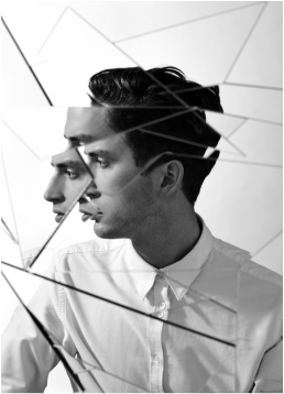
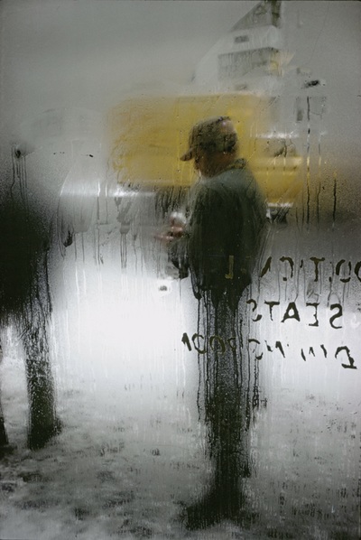
Saul Leiter Image EvaluationI chose this photo from Saul Leiter because it uses a lot of Formal Elements to make the image very abstract such as Depth, Texture, uses a range of Tones and a Splash of Colour. Depth is a important Formal element in this photograph because it feels as if the photo is using layering in the Text, Window and the condensation and then the Truck behind it all has depth. The use of layering creates a effect that makes it feel like there is no actual clear subject so there us so much to look at. The splash of yellow in the background is good because everything else is pretty dark and simple with the white snow and the guy wearing blacks and browns and the bright yellow in the middle changes it up and draws attention to it. Saul Leiters photographs are abstract because he uses all the formal elements in his photo's such as in some photo's he makes use of cropping but also uses elements from Street Photography.
|
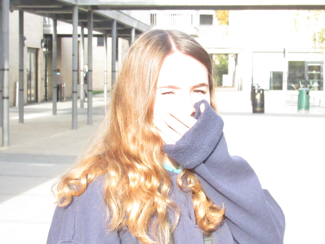
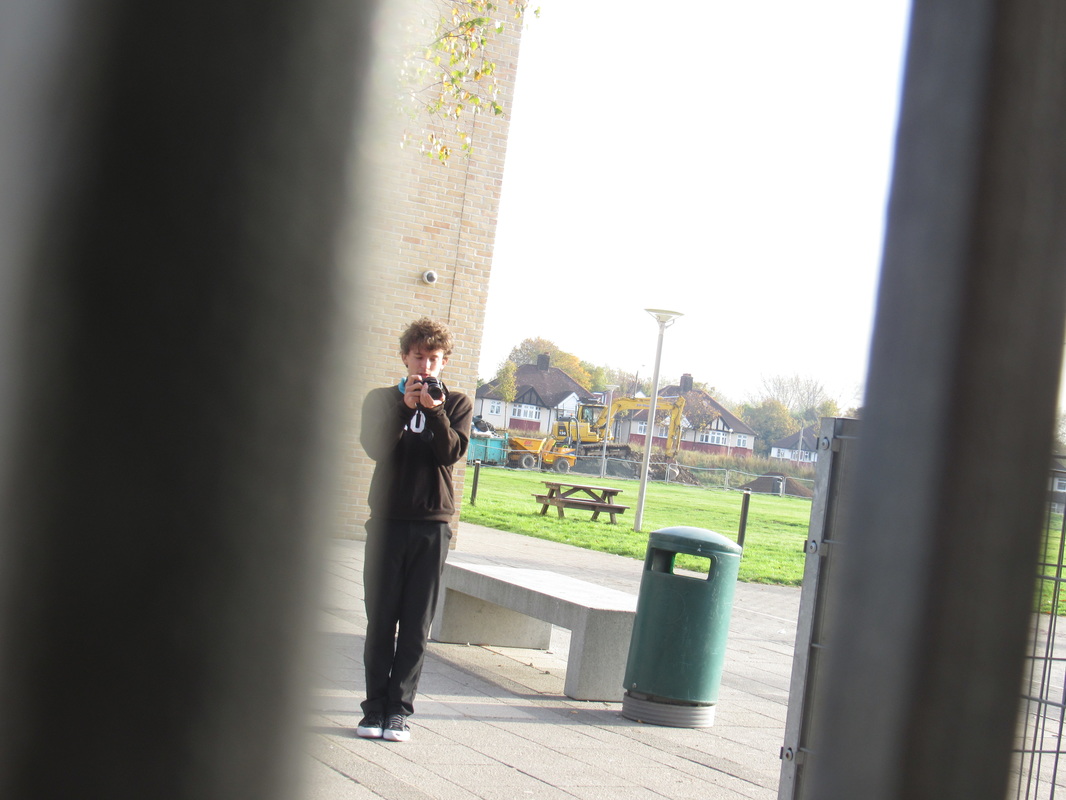

Our task was to go out and take some abstraction photographs influenced by a abstract photographer Saul Leieter and I decided to go around the school with a camera trying to capture images using similar abstract elements that Saul Lieter would use in his work such as framing, line, colour and texture which I did quite successfully although some of my photo's could be improved by maybe adding more intriguing/unusual anles by getting the same shot and taking many different images from different angles of it.
John Baldessarri
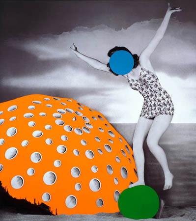
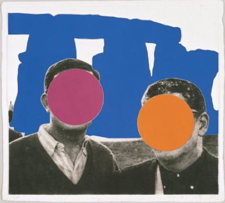
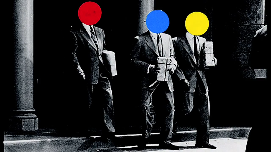
John Baldessarri is an American photographer that found old photo's in garbage which would usually be family photographs or other self portraits. He covers the faces of the people in the faces with bright, primary coloured circles and covers certain parts of the image with bright colours which makes the photo catching to the eye. He began print making in the 1970's but his career started with words painted onto a canvas. He studied at San Diego State College in 1953 and then went to the University of California in Los Angeles and Berkeley before recieving his masters degree in 1957. He originally intended to be an art critic but instead he worked for a major art center in Los Angeles. He then went on to teaching many students art. His images are very unusual where he adds the very bright colours onto black and white photographs of random people.
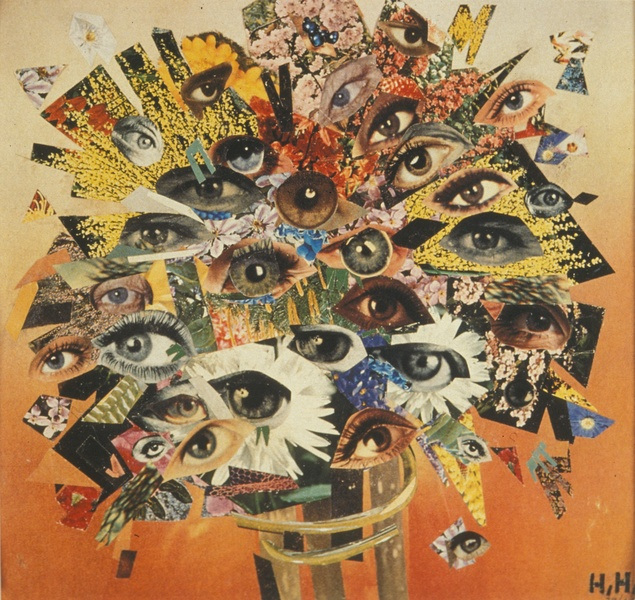
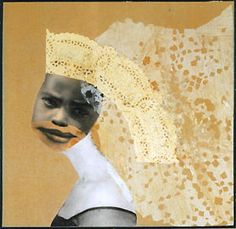
Hannah Höch
Hannah Höch was a German dada artist she is best known for her work in the Weimar period and is one of the first creators of 'Photomontage' which is similar to a collage but it is cutting, gluing, rearranging and overlapping two or more photographs which was her style of work. She rearranges images from text and mass media Höch also drew inspiration from the college work of Picasso and fellow Dada artist Kurt Schwitters and her work is similar to these two with the layering and cutting and gluing. Hannah rejected the German Government but focused most of her criticism on the Gender issues and was a feminist and the stereotype that women can't be as successful as men in art and photography. Her work is uses abstract geometric shapes such as triangles and Squares of pieces that she found in newspaper and other sources.
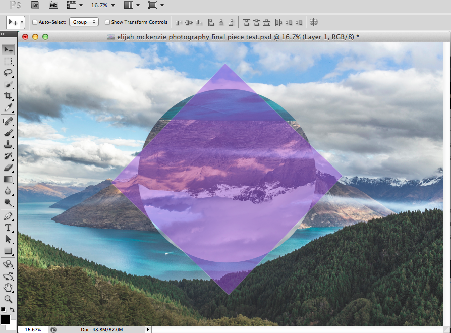
Final Piece Idea's
My final piece idea will use photoshop to make a abstract polyscope of a long shot of the blocks in school and some other places with different colours and shades to make triangle, circles and other abstract basic shapes with different filters and saturation to create the line for to define the difference between all the shapes I found a tutorial on how to do this properly on pinterest all I will need is to take a few photo's and then to photoshop them to make the polyscope pattern. http://blog.spoongraphics.co.uk/tutorials/how-to-create-an-abstract-polyscape-in-adobe-photoshop
|
I couldn't find any artists that use this kind of photography in their work so I started to make a practise piece using found images off the internet this is what I got so far I will be using the same technique with my own photo's that I will take in school My initial idea'sMy initial idea was to get 2 of my taken photo's and make a polyscope in photoshop with I have done this once already and I want to make a total of 4 and to frame them on a big board and print them out as a A4 image and stick them on in a regular order. I might try different designs and colours in each photo I will take the rest of my photo's in the next lesson where I will hopefully finish it.
|
|
Final Piece
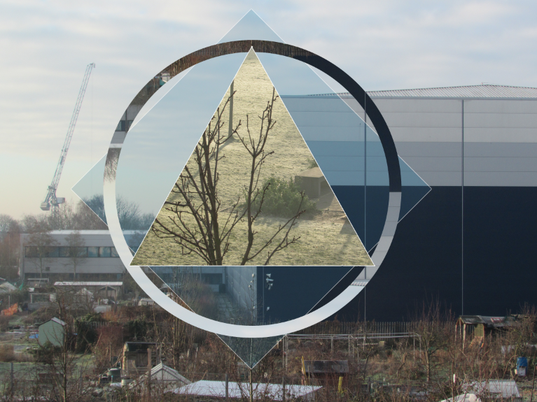
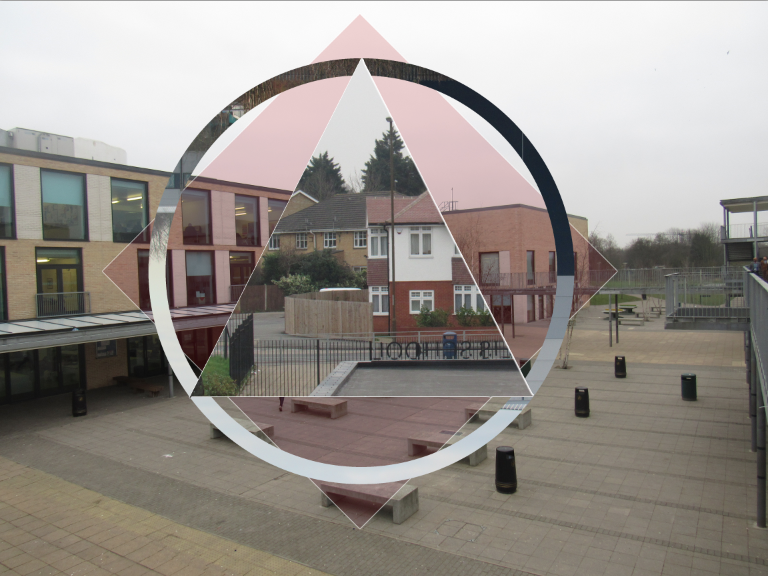
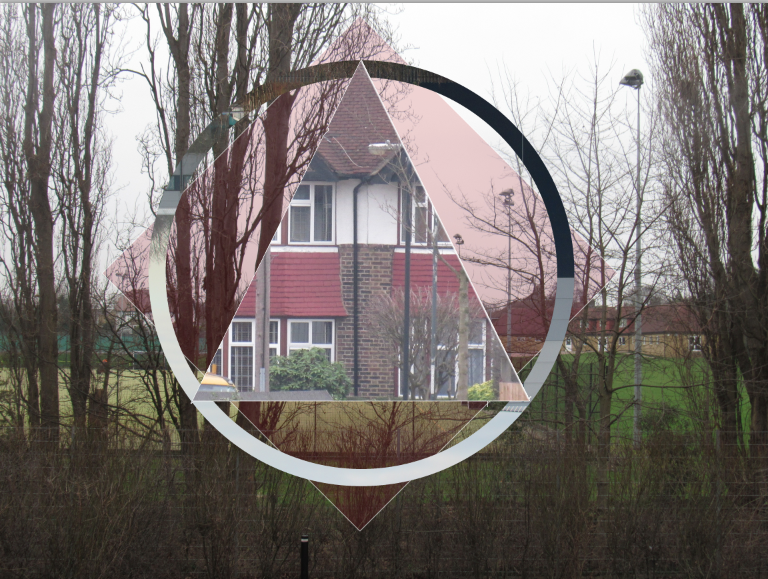
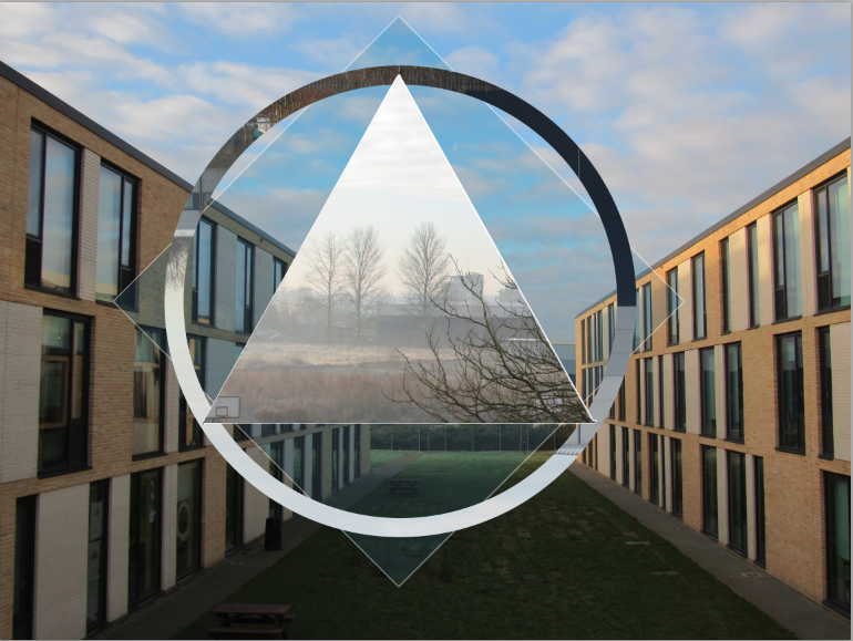
I have made 4 of these 2 of them have are red and 2 are blue and they will be mounted on a piece they have printed out all 4. The photo's are good but I could make them look more abstract by taking more abstract photo's to work with. I have made the photo's using the exact same method but I think it would be better If I made them all different for more of a variety in the piece but I used the same due to I had not much time to do it. The photo's could be more accurate like the shapes could be more centred into the screen and made with exact measurements other than freehand and just placing it where it looks best other than accurate measurements in the photo. Otherwise i'm positive it will look good once complete and all mounted in a order that will make the red contrast with the blue.
